Logo design for Pixel Spring, a lean development company. The company later changed names and this mark was never used. Creating a balance design, incorporating negative space, rigidity, and flexibility all in the same graphic was a fun undertaking. Here is a black & white versions of the logo.
Corporate Identity Logos
A Permaculture Podcast
As a volunteer at Festival Beach Food Forest, I discovered the resilience of nature and became aware of abundance around me, in plants I had…
Motion Graphics Reel
This compilation includes motion graphics and visual effects samples by Leah Lovise, created for Bazaarvoice, Chiral Balance, Elephant Productions, Fosforo Films, Moon City Media, Polly Mermaid, Quixote Entertainment, and University of Texas TEx Total Educational Experience. Enjoy!
Undone
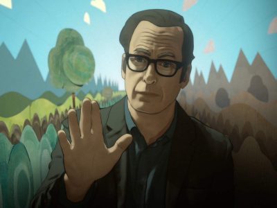
Senior animator with Minnow Mountain‘s rotoscope team for the sci-if series, Undone. After 28-year-old Alma nearly dies in a car accident, she finds that she…
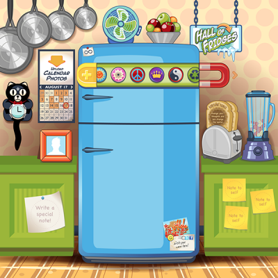
Infinite Refrigerator
Precious works of artwork are often found in the kitchen! The intricate stories, simple drawings, and daily achievements of our kids are traditionally found displayed…
Art for Art Sake
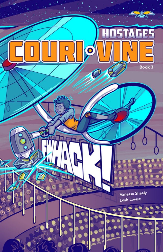
Hostages COURI VINE Book 3
The third book of the COURI VINE series, called Hostages, is complete. Find out more about how you can help us print this book and…
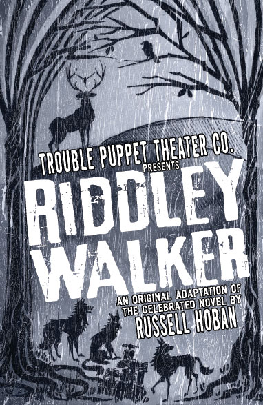
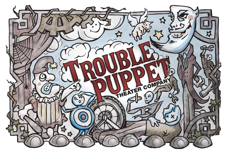
Riddley Walker
Poster design for Riddley Walker, adapted for Trouble Puppet Theater Company by Artistic Director Connor Hopkins, from the award-winning cult-classic novel by Russell Hoban.
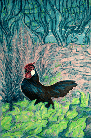
Rosecomb Bantam Rooster in the Sweet Potato Vine
Raising bantam chickens in central Austin, Texas has altered my perceptions of cultivating one’s own food. Caring for these birds, collecting their eggs, and simply…
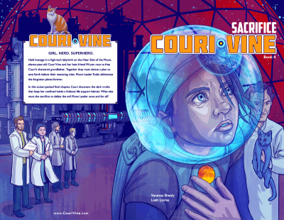
Couri Vine book 4 Sacrifice
Book 4 Sacrifice ends the first series of Couri Vine. Held hostage in a high-tech labyrinth on the Near Side of the Moon, eleven-year-old Couri…
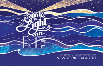
Children’s Tumor Foundation
In 2017, I had the honor of designing the invitation for the Children’s Tumor Foundation New York Gala to raise funding for NF awareness.
Cruel Circus
This is an illustration for Trouble Puppet Theater Company‘s Cruel Circus. Here’s a review of Cruel Circus by Adam Roberts of The Austin Chronicle. Here…
Collapsus
Collapsus is an interactive cross-media game that combines live action, rotoscope animation, interactive fiction, and documentary film. The story is set in the near future, portraying the affects that the world energy crisis has on international politics and the growing population.
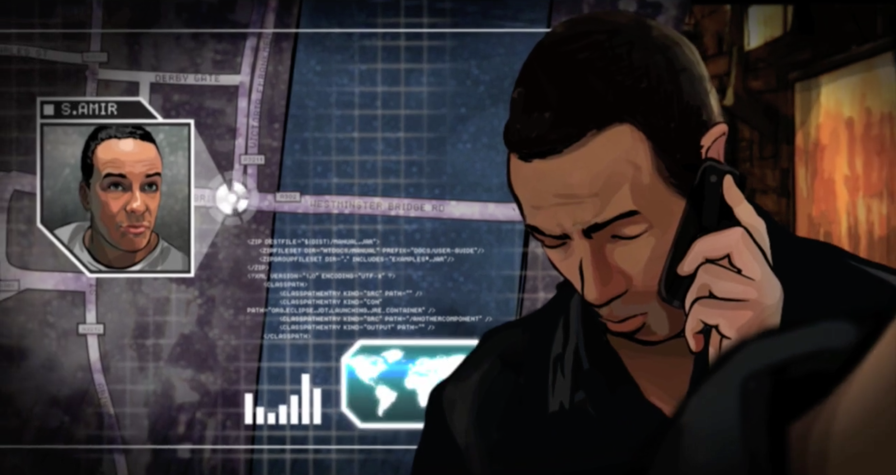
Collapsus is produced and directed by Tommy Pallotta and received an Emmy nomination for Best Digital Fiction, a People’s Choice Award and Interactive Award nominations at SXSW 2011, the Dutch Spin Award, and a World Summit Award.
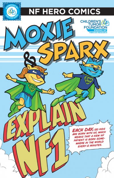
Moxie & Sparx Explain NF1
Using the existing art from the Moxie & Sparx Explain NF1 comic book, I created a motion comic for Children’s Tumor Foundation to explain neurofibromatosis…
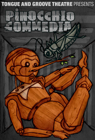
Local Theatre in Austin
Tongue and Groove Theatre commissioned this poster design for their Pinocchio Commedia.
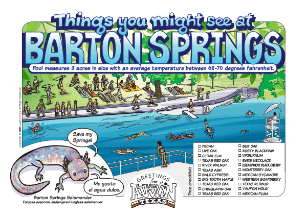
Things you might see at Barton Springs
Greetings from Austin, TX postcard series.
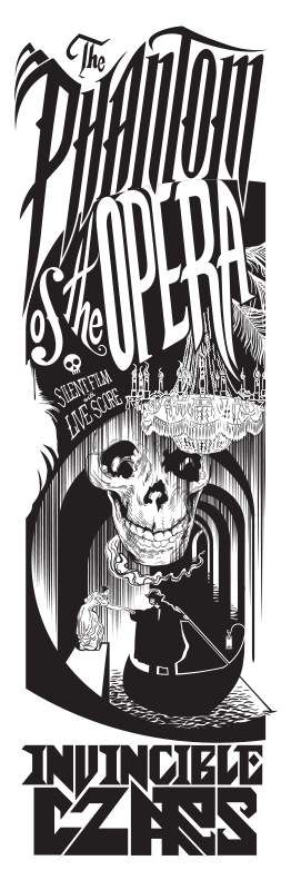
Phantom of the Opera
Art print for The Invincible Czars’ tour of the silent film with live original score.
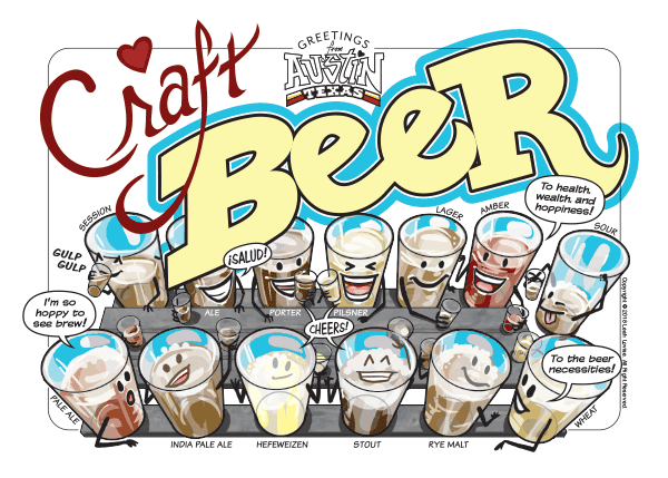
Craft Beer
Greetings from Austin, TX postcard series.
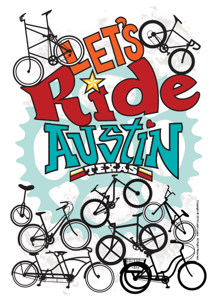
Let’s Ride Austin
The Austin Chronicle
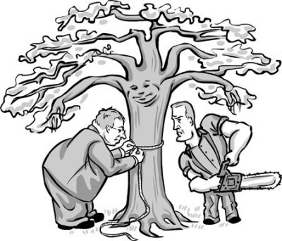
Heritage Tree Ordinance Takes Root Tree lovers stand their ground – and win Keller Keeps Her Robes, for Now Special judge says Keller’s conduct in…
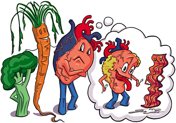
What the Heart Wants
Healthy eating isn’t always happy eating

Skull with Artichokes and Tulips
Oil on canvas
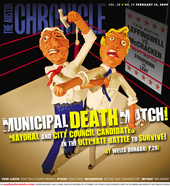
MUNICIPAL DEATH MATCH!
Cover art by Leah Lovise for the February 13, 2009 issue of the Austin Chronicle. Medium: clay sculpture.

South Congress Bridge Bats
Greetings from Austin, TX postcard series.
You are here, and here we go!
It’s not always necessary to reinvent the wheel, but reinventing oneself is a ceaseless process. A career in graphic designer means practicing this act of…
Editorial Illustration
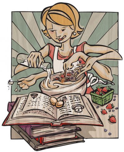
Originally drawn for the Austin Chronicle. Read to EatStart the summer with great food stories and recipes worth a little perspiration Beyond Black-Eyed PeasNew…
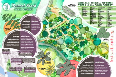
Festival Beach Food Forest
These designs where created for the signage at the Festival Beach Food Forest a grassroots pilot project neighboring the Festival Beach Community Garden and RBJ…
Our KickStarter goal was met! Books 3 & 4 of COURI VINE have had a first print run! Many THANKS to the 111 wonderful people who backed our project!
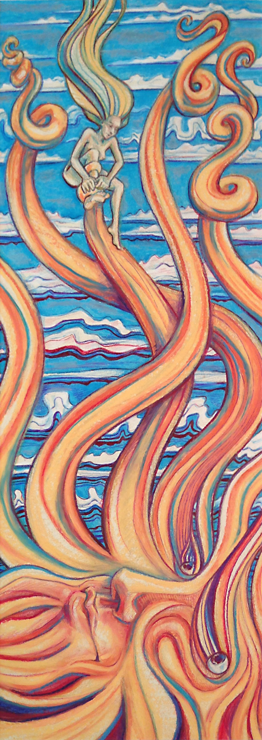
Untitled
Oil Pastel for local Austin art show, BYOBeard.
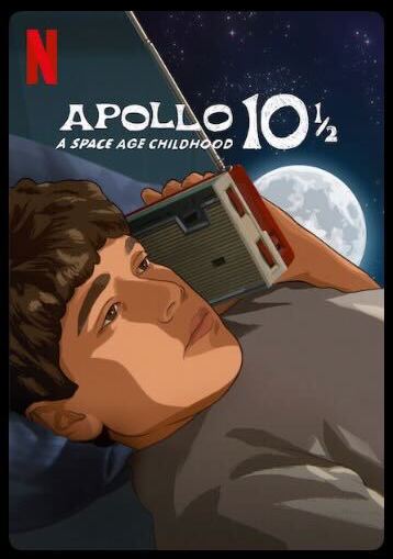
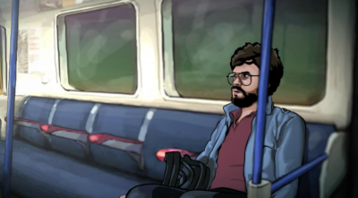
Rotoscope for Linklater
In 2005, I moved to Austin, Texas to work as a rotoscope animator for the film A Scanner Darkly. In 2020, another Richard Linklater film…
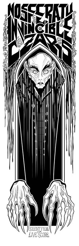
Invincible Czars’ Nosferatu
Art print for The Invincible Czars’ tour of the silent film with live original score.
Load More